Wall Talk: Do We Even Need Museum Wall Labels?
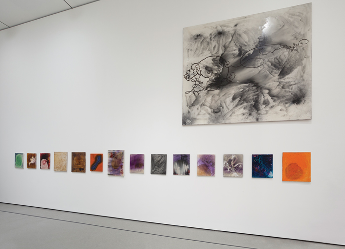
Installation view of “Alibis: Sigmar Polke 1963–2010” at MoMA, which did not use wall texts.
COURTESY MOMA
There was a time when the labels and texts in museum shows were matter-of-fact explanations—the artist, title, date, medium, and then a few informative words from the curator. But as exhibitions have become more extravagant, provocative, and controversial, attended by a public that is increasingly diverse, museum staffs face greater challenges in satisfying everybody.
Are the curators considering issues of political correctness, acknowledging suspect sources of funding, fudging facts about a collector’s (or an artist’s) questionable politics or private behavior, or withholding anything that might be relevant to the public’s desire for information? As institutions reach out to broader audiences, the proper nature of wall texts has been provoking debate, and even hostility, among museum factions. All the while, focus groups, audience surveys, and academic studies have been trying to sort it all out.In the wake of allegations that Bill Cosby drugged and sexually assaulted some 40 women, scant attention has been paid to the comedian’s activities as an art collector. But a few sharp-eyed critics did take note of Camille and Bill Cosby’s loan of close to a third of the works in the exhibition “Conversations: African and African American Artworks in Dialogue” at the Smithsonian’s National Museum of African Art in Washington, D.C. In an open letter to the museum published last July on the website Hyperallergic, writer and editor Jillian Steinhauer made the following request: “Remove the portraits of him and the quotes by him, the lines of wall text that make Bill Cosby sound like a kind-hearted family man.” Kriston Capps, writing in the Atlantic, suggested striking the Cosbys’ name entirely from the show.
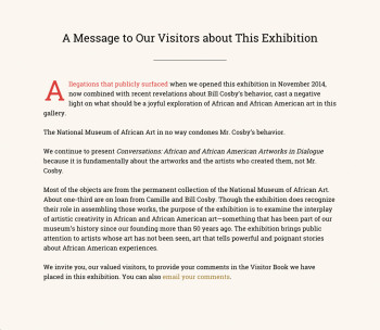
The message posted at the National Museum of African Art in the wake of the Cosby rape allegations. (Click to enlarge.)
COURTESY NATIONAL MUSEUM OF AFRICAN ART
In response, the museum did not change a word of text or remove the offending portrayals of the Cosbys. Instead, it posted a message to visitors on its website and in the show stating that the NMAfA “in no way condones Mr. Cosby’s behavior,” explaining, “the show is fundamentally about the artworks and the artists who created them.”
“In general, we don’t make changes,” said Eddie Burke, head of communications for the museum. “It’s only on a very rare occasion, and that would be around the public not understanding the wall text.”
The Cosby case is not the first instance of wall text coming under attack for a failure to address or acknowledge objectionable or unethical matters. Motivated by a different kind of moral concern, in 2012 the Metropolitan Museum of Art’s otherwise highly praised exhibition “The Steins Collect” drew outrage from, among others, writerJanet Malcolm, civil liberties lawyer Alan Dershowitz, and Manhattan Borough President Scott Stringer for its reluctance to address Gertrude Stein’s Nazi sympathies. Under pressure, some text was changed, but as Malcolm opined in a report by Emily Greenhouse in the New Yorker, it was “very inadequate.” Sometimes the problematic behavior is not that of the collector but rather of the artist or the artwork itself, with critics aiming at the museum for not taking a position on what we are looking at. It’s one thing to draw a discreet screen across Courbet’s Origin of the World in an exhibition the way the Met did in its tribute to the artist seven years ago, but another to gloss over more flagrant controversial issues. The 2014 Jeff Koons retrospective at the Whitney Museum drew ire on many fronts, including that of the text accompanying the exhibition. “The labels in the Koons show were a kind of disinformation campaign on the part of… the museum,” said Eric Gibson, a critic for the New Criterion and editor of the Leisure and Arts page of the Wall Street Journal. “They’re telling you what you’re supposed to be seeing. It’s a kind of mind control, almost.” He cited in particular the “Made in Heaven” series, featuring Koons and his then-inamorata engaging in acts that leave little to the imagination. “These things are pornography,” said Gibson, “but we are assured from the wall labels that they are not pornography; they are rather a vulnerable form of self-portraiture.”
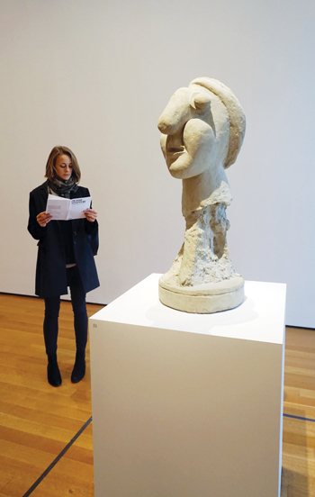
“Picasso Sculpture” at MoMA features brochures with diagrams denoting caption information.
KATHERINE MCMAHON
Controversy over wall text today might be said to have dawned with the age of heightened sensitivities to other cultures, races, and sexual proclivities a few decades ago. Perhaps the greatest “disinformation campaign” in late 20th-century art history occurred in the 1984 “Primitivism in 20th Century Art” exhibition at the Museum of Modern Art. The labels provoked a firestorm of controversy and led many museums to re-think how to present so-called primitive art in Western contexts.
But if there is disinformation or politically incorrect information to consider, there is also misleading or just plain wrong information. When the Whitney opened in its new home in downtown Manhattan this spring, Los Angeles Times critic Christopher Knight noted that the museum had posted wall text in its fifth-floor galleries that referred in a “false and defamatory way” to a review he had written of the landmark 1993 Whitney Biennial—the first to showcase non-white-male artists. The curators claimed that Knight, the only critic cited by name, attacked the show’s artists as “lacking quality,” when in fact his review, in his words, “attacked the show’s curatorial thesis as lacking quality.” The wall text seemed designed primarily to make the Whitney appear groundbreaking and unusually prescient (other critics, unnamed in the wall text, but including Roberta Smith and Arthur Danto, also had serious reservations about the biennial). Knight demanded corrections and, after much back and forth with director Adam Weinberg and the press office, got a rather modest emendation. “My review complained that the so-called ‘political’ or ‘multicultural’ ’93 biennial actually just continued the usual straight-white-male privilege,” he told ARTnews. “Neither the original Whitney wall text nor the revised version gives the slightest hint of that, instead favoring self-aggrandizing misrepresentation.” So what kinds of wall text make critics happy? As a curator at the Met for 29 years, Gary Tinterow, now director of the Museum of Fine Arts, Houston, followed a few rules. “First I want to know, what is this thing? Is it a replica or a fragment of a larger composition? Is it an oil painting or a watercolor? A devotional object or an object of utility? And does this object relate to other works by that same artist? And I like to, in some way, point to a distinctive feature that will guide the viewer to something that’s happening in the work. And then, if the artist has said something, I like to offer a quote that in some way again will open up an exploration of meaning or importance.” Another option is dispensing with wall text altogether, as MoMA did for its ongoing and highly praised “Picasso Sculpture” exhibition, replacing the labels with a brochure providing basic information on each piece. The move raised more than a few hackles among critics and public. Lee Rosenbaum’s response on her blog “CultureGrrl” was fairly typical: “To get rudimentary information about titles, materials and dates, you had to look closely at the object and then figure out which crude line drawing in the booklet offered to visitors was intended to represent it. (Picasso the draftsman my be rolling over in his grave at those scrawled depictions of his work.)” At the press preview for the show, Rosenbaum reported, curator Ann Temkin told the audience that the no-labels approach was designed to make the works “easier and more accessible for our visitors: You wouldn’t constantly be walking back and forth because the sculptures aren’t against the wall.” Temkin added that “it’s a tryout, and if we find it’s annoying for people, those labels can go up in a day.” In the end MoMA came up with a compromise solution: revising the brochure and adding numbers to all the pedestals to correspond with the brochure. According to the museum’s communications department, “people liked it for this show.” Even Metropolitan Museum of Art director Thomas Campbell posted on Instagram, “Normally, I think contextual information is important, the narrative that we, curators, add. But in this case, it was delightful to see the sculptures speaking for themselves without words getting in the way.” Curators often have sensible reasons for opting out of text and labels entirely. For MoMA’s 2014 Sigmar Polke retrospective, associate director Kathy Halbreich chose a brochure and diagrams for each gallery. The main reason, she explained, was that the show “was very densely hung in some parts, and I was afraid the labels would make the gallery look like it had succumbed to chicken pox.” When the new San Francisco Museum of Modern Art opens in the spring of 2016, senior curator Gary Garrels said, decisions to use text will be on a case-by-case basis, with galleries or shows devoted to artists like Agnes Martin or Robert Ryman eschewing labels entirely. And in re-hanging Old Masters at the Worcester Art Museum in Worcester, Massachusetts, director Matthias Waschek also decided to get rid of “that damn piece of paper” and place the works in groups, instead of side by side, and often tilted away from the walls for better viewing. The paintings would thus seem to be in dialogue with one another, and visitors would be encouraged to linger, looking for common ground. Inspired by certain collectors he had visited, Waschek wanted to re-create that experience in the museum: “There was no administrative hand,” he said. “These works were just blossoming on the wall and in the room, without labels.” (Visitors to Worcester will still be able to find information on cards within the galleries, on iPads, and on different sorts of apps for their phones.) With the ability to send pictures and texts at the disposal of many visitors, wall text—or the absence thereof—can come under ever more democratic scrutiny, with spectacularly misguided examples making their way to friends and Facebook in a nanosecond. And perhaps wall text will one day be a curious artifact of the past. Even now you can open an app on your smartphone, watch a video of an artist explaining her work, or access a talking head on a touch screen. “Ten years from now this discussion about wall text may be almost quaint,” said Rosenbaum.
By Ann Landi
Source: http://www.artnews.com